Making Climate Data Clear, Human, and Actionable
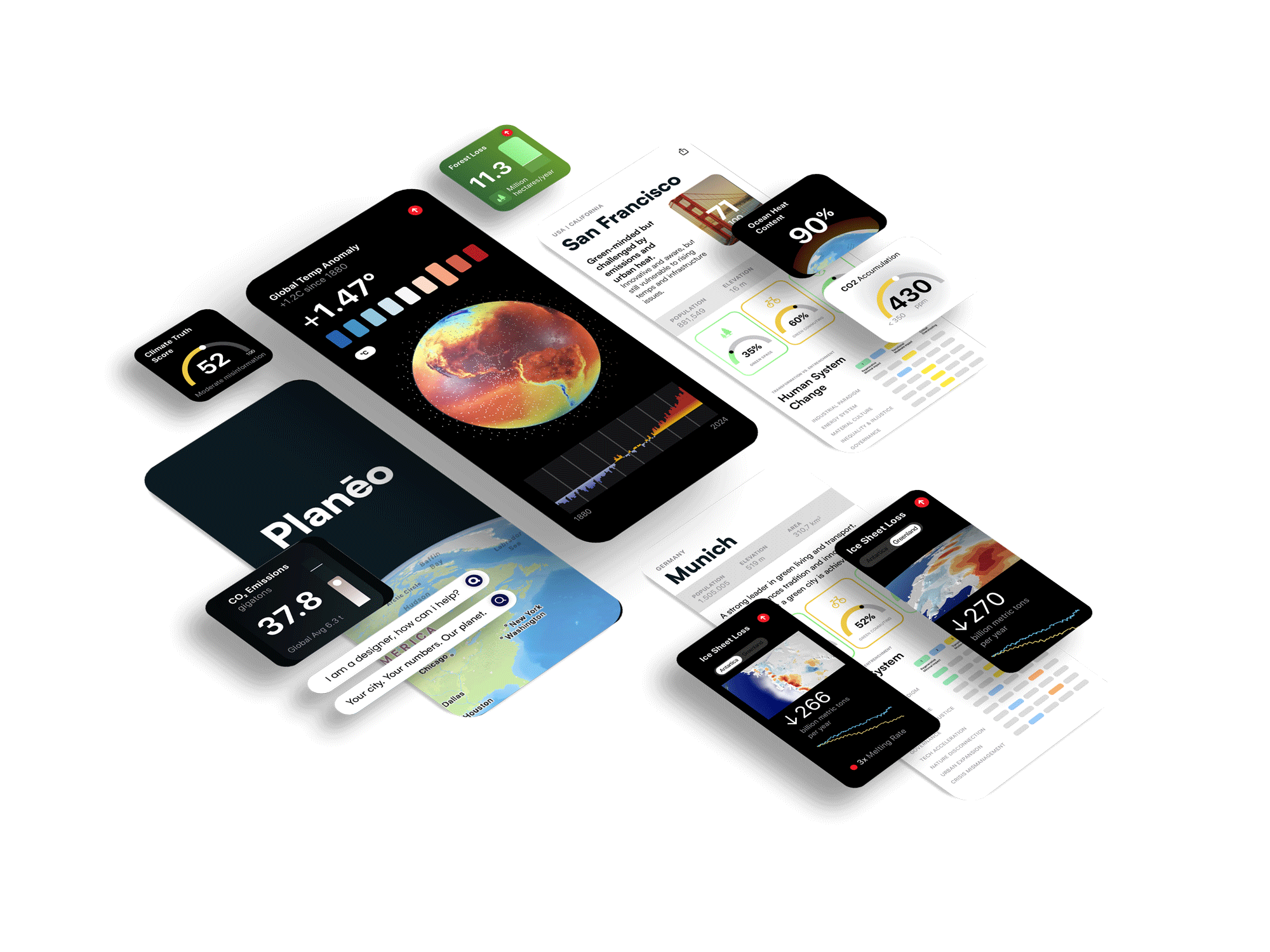
Planēo is a concept for a climate-tracking platform designed to turn overwhelming environmental data into simple insights that help people understand change—and respond to it.


The Idea
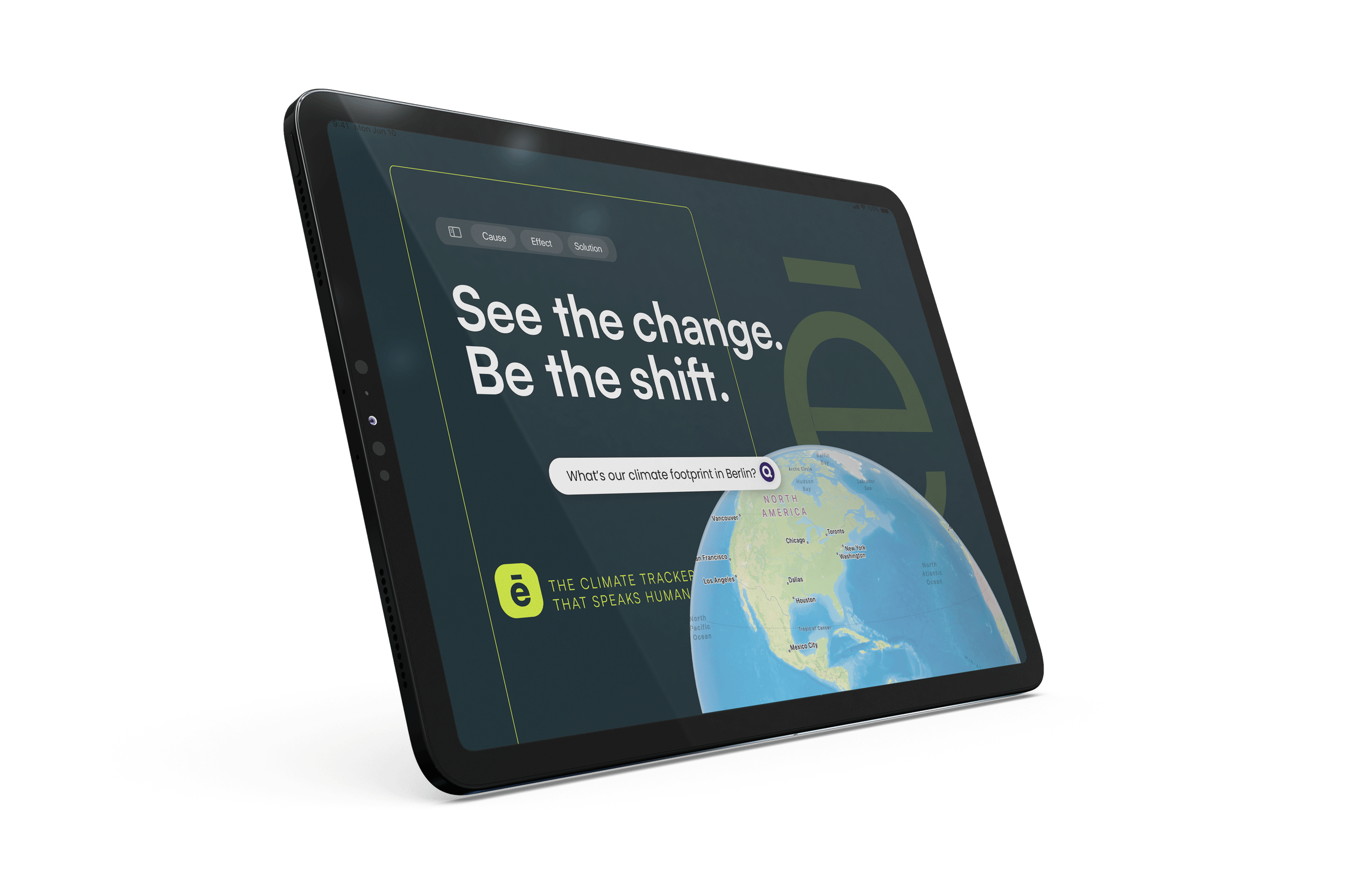
A tool that reframes climate data into something easy to read, like the weather app, empowering rather than paralyzing.
From CO₂ levels to temperature rise, melting ice to deforestation — Planēo shows the most critical indicators of global change, updated daily.
Track the climate crisis in real time
Cause and effect, side by side
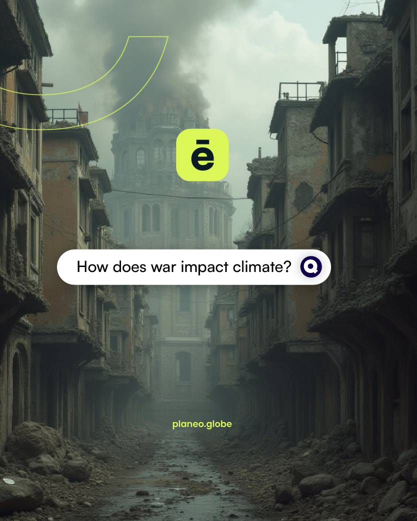
Understand not just what’s happening, but why. Each metric is paired with its root causes and long-term effects.
Explore climate data at the global, country, and city levels. See how your community fits into the bigger picture.
Global + local insight
Native iOS experience
Built using Apple’s UI standards for a seamless, intuitive, and minimal design that feels right at home on your device.